Wine Can Label Project Case Study
Purpose
This project aimed to design a wine can label for Twocan, a product inspired by toucan conservation efforts at Rescue Ranch. The goal was to create packaging that appealed to Generation Z by blending bold aesthetics with a deeper mission of environmental advocacy.
Problem
The challenge of the project was to create a wine can label that stood out visually while also clearly communicating Twocan’s conservation-driven purpose. The solution needed to resonate with a younger audience that values authenticity, sustainability, and design-forward brands.
Solutions
The final can design was vibrant, intentional, and mission driven.
Key elements included:
Bright, nature-inspired colors to reflect the toucan and motivate approachability
Modern, legible typography to keep the design professional and clean
Clear messaging about the conservation cause, seamlessly integrated into the visuals
My Role
In my capacity within this project, I assumed the leadership role in the design team. This role enabled me to thoroughly navigate and innovate through several phases of the project along with four other team members while effectively communicating with the marketing team. Through adept communication and execution with both teams, we successfully navigate through each phase, leveraging the contributions of all team members.
The collaborative experience in this project required thorough communication to all team members to ensure that effective production was executed on all levels ranging from in-depth examination of user-aspirations to the strategic planning and layout of the can designs.
Outcomes
Enhanced user experience and fan engagement
Gained experience balancing innovation with feasibility
Learned to adapt to evolving project requirements
Deepened understanding of design standards in the sports industry
Criteria
Company Name: Twocan
Slogan: Twocan Do It
Product Type: Wine (Beverage)
Target Audience: Generation Z
Wine Flavors:
Pineapple Paradise (White Wine)
Jungle Juice (Red Wine)
Logo: Toucan
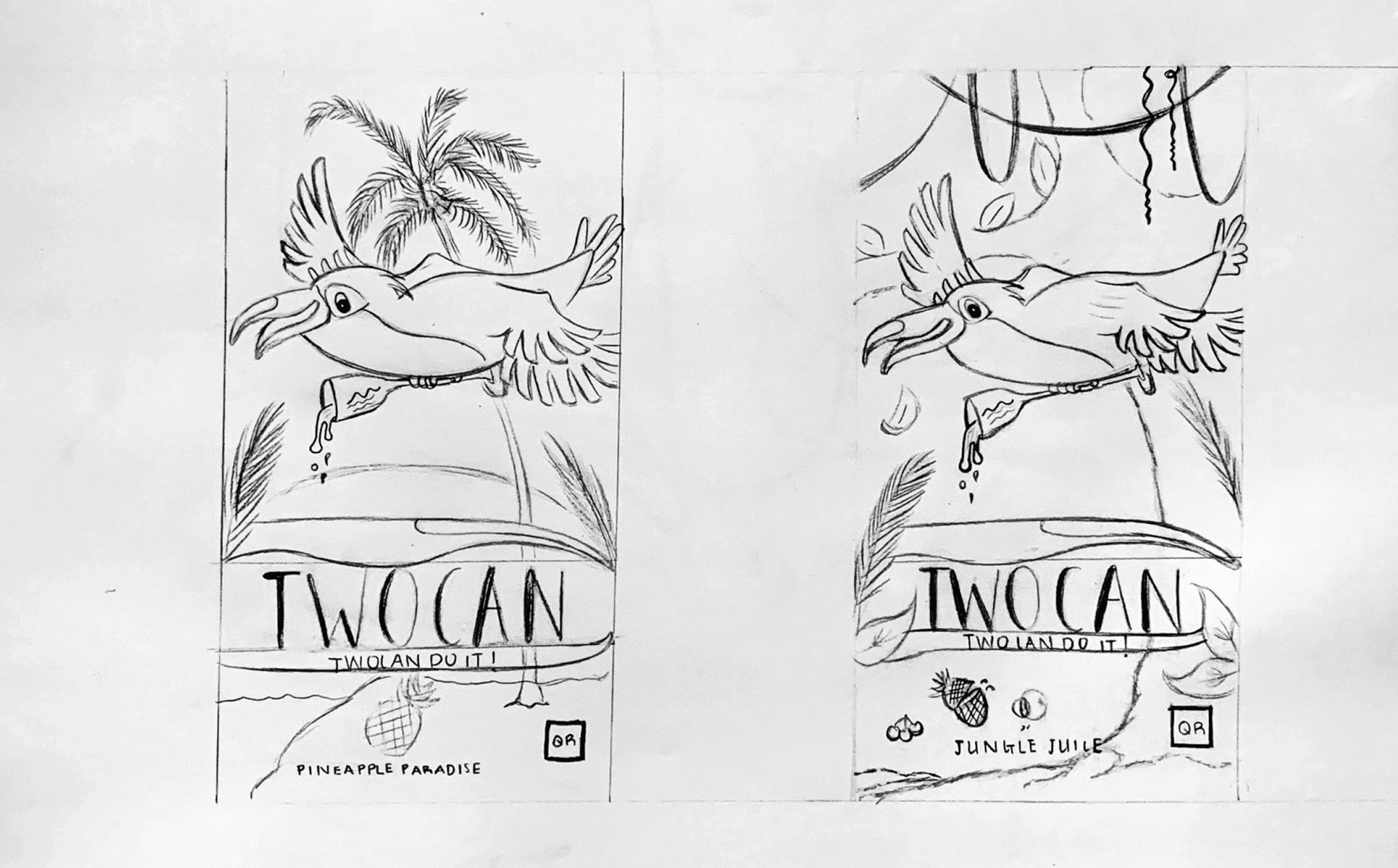
Sketches
Process
Elemental Contributions
Outlined below are my visual contributions, encompassing vectors, thumbnails, roughs, and comps. It’s worth noting that while I included various sketches, not all were ultimately selected for the final design, as the decision-making process involved input from other team members.
Thumbnails
Roughs
Comps
In this phase, the critique and evaluation stage converge towards a unified focus for our design conclusions. Each member of the design team was assigned specific elements to develop, aligning directly with the chosen design. My contributions shown below consist of sketches and assets crafted for the final design.
Toucan White Wine
Toucan Red Wine
“Twocan” typeface
Jungle Juice Background
Assets
Pineapple Paradise Background
Final Design
Pineapple Paradise
Jungle Juice


